Aspromonte
– brand design, visual identity, label design, packaging
(2020)
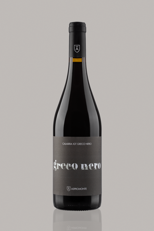
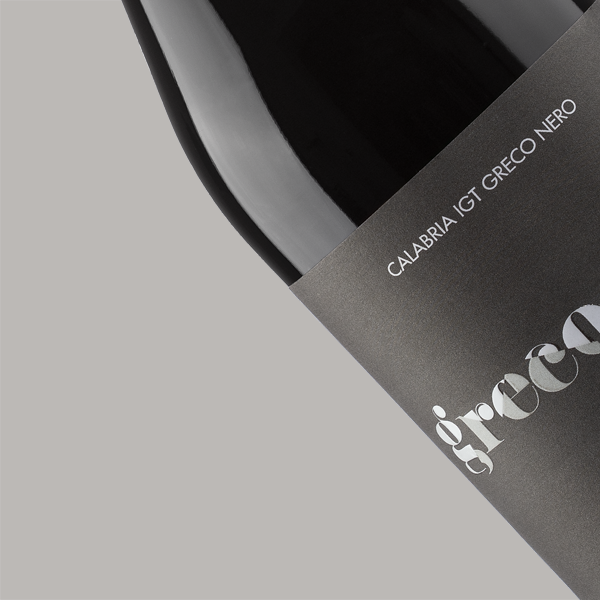
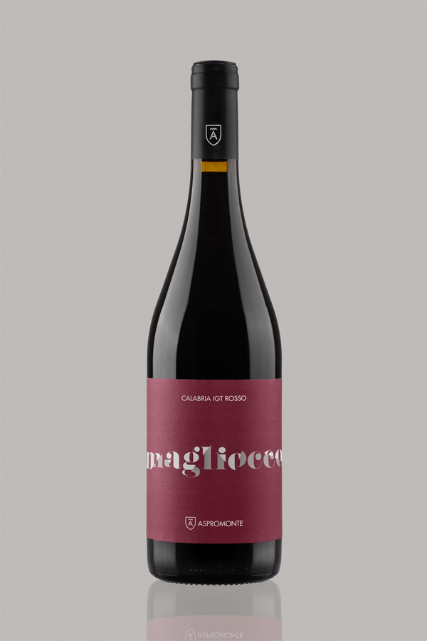
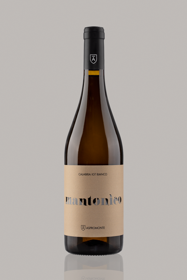
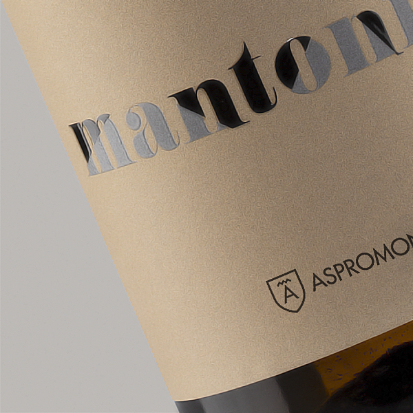
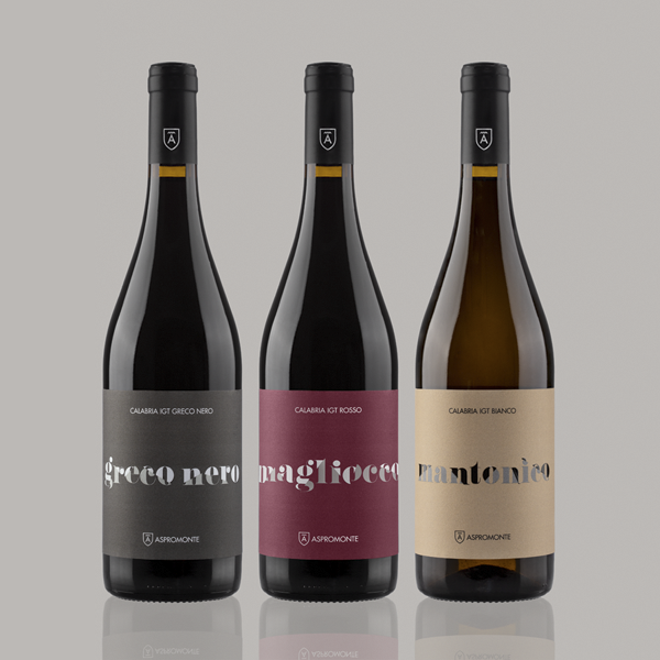
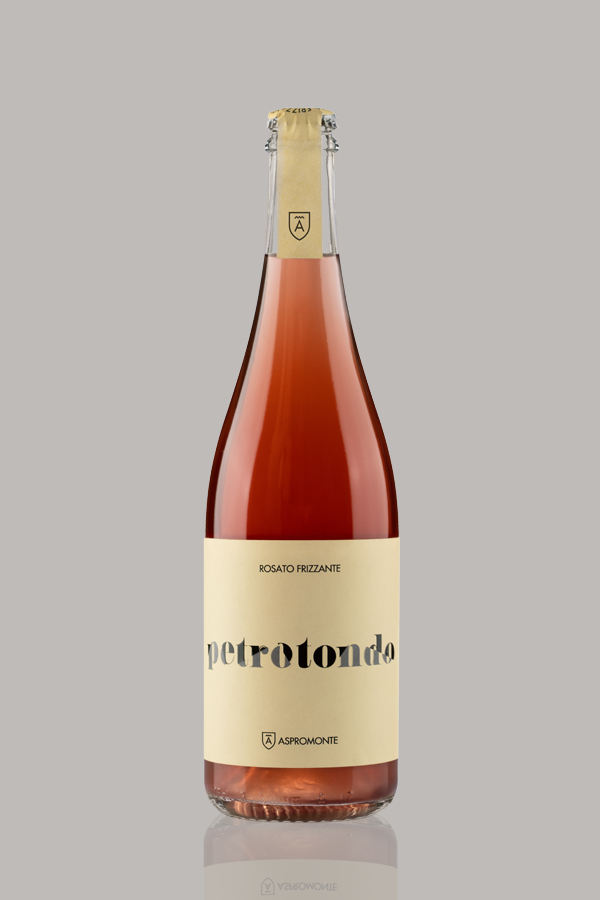
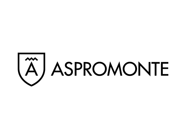
L'azienda vitivinicola Aspromonte ha sede a Ciminà, piccolo paese che sorge nel comprensorio dell'antica Locri Epizefiri, l'ultima delle città della Magna Grecia fondate sul territorio dell'attuale Calabria. Secondo alcuni storici la sua nascita risale al 1453, quando colonie greche, fuggendo dall'avanzata turca, trovarono riparo presso il singolare Monte Tre Pizzi. L'identità visiva aziendale si fonda sulla rappresentazione di "tre punte" già nel disegno del marchio, attraverso l'utilizzo di un glifo tipografico preso in prestito dal greco antico, l'accento circonflesso (formato da una mora accentata e una atona, ossia da un innalzamento e un abbassamento di tono), ripetuto tre volte. L'idea ritorna nel progetto delle etichette tramite il taglio dei nomi dei vini aziendali. I pezzi risultanti dai tagli vengono riposizionati lungo assi definiti, sfruttando i naturali punti di ancoraggio delle lettere. Il sistema si basa su una variazione regolare delle angolazioni, differenti per ciascun prodotto. Alcune lavorazioni di stampa, in aggiunta al colore, accentuano la lettura delle forme ottenute.
Aspromonte winery is based in Ciminà, a small town located in the area of the ancient Locri Epizefiri, the last of the cities of Magna Graecia founded on the territory of present-day Calabria. According to some historians, its birth dates back to 1453, when Greek colonies fled the Turkish advance and found refuge at the peculiar Monte Tre Pizzi ("Three Peaks Mountain”). The corporate visual identity is based on the representation of "three peaks" starting from the design of the brand. The creative way is to use of a typographic glyph borrowed from ancient Greek, the circumflex accent, repeated three times. The same idea returns to the label project by cutting the names of the company's wines. The pieces derived from the cuts are repositioned along defined axes, using the natural anchor points of the letters. The system is based on a regular variation of the angles, different for each product. In the last step, some print finishes on the lettering, in addition to the color, help the reading of the resulting shapes.
© 2024 Mino Sebastiano - info@minosebastiano.com